Your Guide to Perfect Email Banner Size
November 25, 2025

When it comes to email banners, the magic number for width is 600px. Sticking to this dimension ensures your hero image looks sharp and professional across the vast majority of desktop email clients. For height, aim for a sweet spot between 90px and 200px.
Of course, we can't forget about mobile. While the design needs to be fluid, starting with a 600px width gives you the most reliable foundation for responsive scaling. Equally important is keeping the file size under 1MB to guarantee your email loads quickly and doesn’t get flagged as spam.
Your Quick Reference Guide to Email Banner Sizes
Nailing your email banner dimensions is one of the first and most critical steps in building a campaign that lands well with every subscriber. Get it wrong, and you risk a distorted image, painfully slow loading, or a poor user experience—a costly mistake when more than half of all emails are now opened on a mobile device.
This section gets straight to the point, giving you the essential specifications for both desktop and mobile designs. We'll start with the industry-standard width and explain exactly why it's still the safest bet for maximum compatibility. Think of this as your go-to cheat sheet before we dive deeper into the technical details later on.
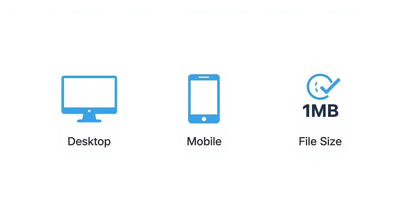
This visual breaks down the core specs you need to remember for desktop, mobile, and file size.

As you can see, a great banner is all about balance: a fixed width for desktop reliability, fluid responsiveness for mobile, and a lean file size for performance. We'll also cover how to handle high-density (Retina) displays and choose the right file formats (like JPEG, PNG, or GIF) to keep everything looking crisp without bloating your email's weight.
Recommended Email Banner Specifications
For a quick overview, here’s a lookup table with the optimal dimensions, file sizes, and formats you should be using for your email banners.
| Device Target | Standard Width | Retina (2x) Width | Recommended Height | Max File Size | Best Format |
|---|---|---|---|---|---|
| Desktop | 600px | 1200px | 90px - 200px | < 1MB | JPEG, PNG, GIF |
| Mobile | 320px - 500px | 640px - 1000px | Fluid/Proportional | < 1MB | JPEG, PNG, GIF |
These specifications provide a solid starting point for creating banners that are both visually appealing and technically sound, ensuring a great experience for all your subscribers.
Why 600px Is Still the Gold Standard Width
You might look at your fancy widescreen monitor and wonder why on earth we’re still designing emails to be a mere 600 pixels wide. It seems a bit old-fashioned, doesn't it? But this isn't some arbitrary number we've all agreed on; it's a battle-tested standard born from the history of email itself, and sticking to it is still the smartest move for your campaigns.
The 600px rule is a direct hangover from the early days of email clients. Think back to the early 2000s, when Microsoft Outlook was king and the typical desktop monitor had a resolution of just 1024 pixels. Outlook's own interface, with all its sidebars and menus, chewed up a good chunk of that screen real estate. This left designers with a narrow canvas, forcing them to adopt a maximum width of 600px to ensure nothing got cut off. You can get a deeper understanding of how these early constraints established lasting best practices for email width.

This "golden rule" stuck, and for a very good reason: maximum compatibility.
Ensuring Consistency Across Email Clients
Even today, a surprising number of email clients—especially desktop versions of Outlook still widely used in the corporate world—have fixed viewing panes that just aren't kind to wider designs. While web-based clients like Gmail are much more forgiving, you can't assume all your subscribers are using them.
Designing to 600px is the safest bet. It ensures your email lands in the inbox looking exactly as you intended, with no awkward horizontal scrollbars or squashed images. It's the most reliable way to deliver a professional, consistent experience to absolutely everyone on your list.
What's more, a 600px-wide foundation is the perfect starting point for responsive design. It's straightforward to adapt this layout to scale down gracefully on smaller mobile screens. This approach means you can build one solid email that looks fantastic everywhere, from a huge monitor to a tiny phone, without ever worrying that your design might "break" for a chunk of your audience.
Optimising Banners for Mobile and Retina Displays
A banner that looks brilliant on your desktop can quickly turn into a blurry, unreadable mess on a mobile phone or a high-resolution laptop. To make sure you’re always putting your best foot forward, your email banner needs to be properly optimised for every device your audience might use.
This really comes down to designing with two key scenarios in mind: smaller mobile screens and those super-sharp, high-density Retina displays. If you don't plan for this, you're gambling with the first impression your email makes.

Designing for Mobile First
It's no secret that most emails are now opened on mobile devices, which makes a mobile-first approach absolutely critical. We've seen email banner sizing practices in the UK shift quite a bit to keep up with this trend. As a rule of thumb, the recommended mobile email banner dimensions for UK campaigns are between 320px and 385px in width, with a height of around 100px. This keeps the banner visible without completely taking over the screen on smaller devices.
This focus ensures your key message hits home immediately for subscribers scrolling on the go. If you want a wider perspective on how image sizes work across different channels, check out this excellent guide on optimizing image dimensions across platforms.
How to Handle Retina Displays
High-density screens, which you’ll often hear called Retina displays, pack more pixels into every inch. The knock-on effect is that a standard-resolution image can look noticeably fuzzy. Thankfully, the fix is surprisingly simple but makes a world of difference.
Pro Tip: To get your banner looking razor-sharp on high-resolution screens, create it at double the size you intend to display it. For an email template with a 600px wide container, you should be designing your banner image at 1200px wide.
Here’s a quick breakdown of how to put this into practice:
- Create Your Banner: Design your banner graphic at 1200px wide. For example, if your target display size is 600px by 150px, create your image file with the dimensions 1200px by 300px to maintain the aspect ratio.
- Export the Image: Save the 1200px image in your preferred format (like JPEG or PNG), making sure it’s well-optimised for a small file size.
- Constrain in HTML: When you embed the image in your email's code, use the HTML
widthattribute to scale it back down to the standard 600px. The browser or email client will handle the height automatically if you've set the width. For example:<img src="your-1200px-banner.jpg" width="600" style="width: 100%; max-width: 600px;">
By feeding the email client a larger image file and telling it to display it in a smaller space, you effectively force it to render with double the pixel density. The result is a perfectly crisp and professional-looking banner on any modern screen.
How to Build a Responsive Email Banner
Making an email banner look great on every screen isn’t magic; it’s a mix of clever design and some straightforward code. A truly responsive banner adjusts itself on the fly, making sure your hero image is just as impactful on a tiny smartphone as it is on a massive desktop monitor.
The whole idea boils down to fluidity. Rather than designing a rigid, fixed-width banner that looks broken or gets cut off on smaller screens, you build one that can gracefully stretch or shrink to fit whatever space it's given. We achieve this with a combination of flexible image widths and some handy CSS.
Using Fluid Design and CSS Media Queries
Fluid design is your starting point. It's as simple as setting your banner image's width to 100% instead of a fixed pixel value (like 600px). This single change tells the image to always fill the width of its container, which is often the quickest way to get it to scale down nicely on mobile.
But for real precision, you'll need CSS media queries. Think of these as a set of instructions that only kick in when specific conditions are met, like when the screen width drops below a certain point. In the world of email, this is how you tell a banner to behave one way on a desktop and another way entirely on a mobile device.
Here’s a simple breakdown of the process:
- Set a Maximum Width: First, pop your banner image inside a container, like a table cell or a
div. Give this container a maximum width (e.g.,max-width: 600px;) but set its actual width to100%. This stops it from stretching out absurdly on huge screens but allows it to shrink on smaller ones. - Apply Fluid Image Style: On the image itself, add an inline style of
width: 100%; height: auto;. This is crucial for making sure it scales down proportionally, so your image doesn’t get distorted. - Add a Media Query: In the
<head>section of your email's HTML, you'll add a<style>block. Inside, you’ll write a media query that targets screens smaller than your desktop width. For example:@media screen and (max-width: 600px).
A media query is essentially an "if/then" statement for your design. It tells the email client, "If the screen is 600px wide or less, then apply these specific mobile-friendly styles." This is the secret sauce for a properly adaptive layout.
A Practical Code Example
Here’s a snippet of code you can use and adapt. The inline styles handle the basics for most email clients, while the media query in the <head> gives you that extra layer of control for the mobile view.

|
This simple setup ensures your banner holds its 600px width on desktops but fluidly scales down to 100% on mobile, giving every subscriber a great experience. Of course, if you want to skip the hand-coding, checking out the Astonish Email platform features shows how you can use pre-built responsive templates to get this done in a few clicks.
To make things even clearer, here's a table summarising the key CSS properties you'll be using to make your banners responsive.
Responsive CSS for Email Banners
A quick-reference guide to essential CSS media queries and properties for making email banners responsive across different devices.
| CSS Property | Desktop Value (Example) | Mobile Value (Example) | Purpose |
|---|---|---|---|
width |
600px |
100% !important |
Controls the banner's width. We use !important on mobile to override inline styles. |
max-width |
600px |
100% |
Prevents the container from exceeding a set width on large screens. |
height |
auto |
auto !important |
Ensures the image's height scales proportionally to its width, preventing distortion. |
display |
block |
block |
Removes extra spacing that some email clients add below images. |
This table serves as a handy cheat sheet. By combining these properties within a media query, you gain full control over how your banner appears, no matter the device.
Choosing the Right File Format and Size
Getting your banner dimensions right is only half the battle; the file format you choose is just as crucial for how your banner looks and performs. Picking the right format and keeping the file size down is key to ensuring your emails load quickly, look sharp, and don't get flagged as spam.
Think of it like choosing the right tool for the job. Each format has its own strengths, and knowing when to use which one will make your designs far more effective.
Comparing JPEG, PNG, and GIF
The choice between the three main players—JPEG, PNG, and GIF—is always a trade-off between image quality, file size, and special features like transparency or animation.
- JPEG (or JPG): Your go-to for photographs and complex images that are packed with colours and gradients. JPEGs use "lossy" compression, which cleverly reduces file size by discarding a tiny bit of image data, but the quality drop is usually impossible to spot with the naked eye.
- PNG: Perfect for graphics with crisp lines, text, or logos, especially when you need a transparent background. PNGs use "lossless" compression, which means they keep every single pixel of detail, but this often results in a larger file size than an equivalent JPEG.
- GIF: The undisputed champion of simple animations. GIFs are limited to a palette of just 256 colours, so they're not great for high-quality photos, but they excel at adding a subtle, eye-catching bit of motion to your banner.
A golden rule is to keep your final banner file under 1MB, but honestly, aiming for something much smaller is even better. A target of around 100-300KB is the sweet spot. Anything heavier risks sluggish loading times and can even trigger spam filters. If you're running ambitious campaigns with a lot of imagery, it's worth checking out the asset management features on the various Astonish Email plans.
How to Optimise Your Banner Images
Once you've settled on a format, the next step is optimisation. This just means compressing the file to shrink its size without making it look blurry or pixelated.
Here’s a straightforward, step-by-step guide to do it using free online tools:
- Export Your Design: First, save the banner from your design programme (like Canva or Adobe Photoshop) in your chosen format (JPEG, PNG, or GIF). For a photographic banner, choose JPEG; for a logo with transparency, choose PNG.
- Use an Online Compressor: Go to a free compression tool website like TinyPNG or Squoosh. Upload your exported image file.
- Adjust Compression: These tools automatically compress the image. Most will show you a "before and after" preview. If available, use the quality slider to find the perfect balance where the file size is low but the image still looks great. For a JPEG, a quality setting of 70-80% is often a good starting point.
- Download and Use: Download your newly optimised, smaller image file. It's now ready to be uploaded to your email campaign.
If you're dealing with multiple images, using a bulk image resizer can be a massive time-saver. This kind of tool helps you manage dimensions and file sizes efficiently, keeping your emails lean and fast-loading for everyone.
Making Your Banners Accessible to Everyone
A brilliant banner is one that everyone can understand, and that includes subscribers who rely on screen readers. Thinking about accessibility isn't just about ticking a technical box; it's about building an inclusive experience that respects every single person on your list.
When you put accessibility at the forefront, you're making sure your message lands with the widest possible audience. This doesn't just make your emails more welcoming; it often boosts campaign performance by making your content clearer and easier to engage with for everybody.
Writing Effective ALT Text
ALT text (or alternative text) is a short, written description of an image that screen readers announce out loud. It's absolutely crucial for communicating what your banner is about to visually impaired subscribers.
Here’s a step-by-step guide to writing great ALT text every time:
- Describe the Image: Be specific and concise. Describe the image's content and purpose without any fluff. What’s the core message or the action you want someone to take?
- Explain Context and Function: If the entire banner is a clickable link, say so and explain where it leads. For instance, "Banner announcing our 20% off summer sale, click to shop now."
- Keep it Brief: Aim for under 125 characters if possible. This ensures it's easily digestible for screen reader users.
- Avoid Redundancy: You can skip phrases like "image of" or "picture of." Screen readers already identify the element as an image, so it just adds unnecessary noise.
Good Example: "Vibrant banner for the Astonish Email spring collection, showing a laptop with the app open, with a call to action saying 'Start Your Free Trial'."
Bad Example: "banner image"
Checking Colour Contrast
Good colour contrast is a non-negotiable for readability. It's especially important for subscribers with low vision or colour blindness, ensuring the text on your banner stands out clearly from its background.
Here's a simple process to check your contrast:
- Identify Colours: Find the hex codes for your banner's background colour and the text colour you've placed on top of it.
- Use a Contrast Checker: Go to a free online tool like WebAIM's Contrast Checker.
- Input Your Colours: Paste the foreground (text) and background hex codes into the tool.
- Check the Ratio: The tool will calculate the contrast ratio. Your goal is to meet the Web Content Accessibility Guidelines (WCAG) AA standard, which calls for a ratio of at least 4.5:1 for normal text. If it fails, adjust your colours until you pass.
This quick check can make all the difference in whether your message is legible for all your subscribers.
Testing Your Email Banners Before You Send
Never, ever send a campaign without putting it through its paces first. It’s a classic mistake: your email looks absolutely perfect in the design tool, but then it lands in a subscriber's inbox looking completely broken. The countless quirks between different email clients can wreak havoc on your layout, and an incorrect banner size or a rendering glitch can instantly sour that crucial first impression.
Think of testing as your final, non-negotiable quality check. It's the only way to be confident that every subscriber sees your banner precisely as you designed it. This is your chance to catch any embarrassing problems before they can damage your brand’s professional image and tank your campaign's performance.
A Quick Testing Checklist
Before you hit that launch button, take a few minutes to run through these essential checks. This simple process will help you spot how your banner actually renders across the most popular email environments, ensuring a flawless display on every screen.
- Send to the "Big Three": Send a test email to accounts you hold on Gmail, Outlook, and Apple Mail. These three dominate the market and are notorious for having their own unique ways of displaying images and HTML. What works on one might not on another.
- Check on Different Devices: This is critical. Open your test email on both an iOS and an Android smartphone. Then, check it on a desktop computer. This is the fastest way to expose any lurking responsive design flaws that could make your banner unreadable on smaller screens.
- Verify Loading Speed: Turn off Wi-Fi on your phone and open the email using mobile data. Does the banner load quickly, or is there a noticeable delay? If it's slow, your image file is likely too large.
- Use a Preview Service (Optional but Recommended): For a truly comprehensive view, you can’t beat a dedicated email testing service. Tools like Litmus or Email on Acid will generate screenshots of your email across dozens of different client and device combinations, catching obscure rendering bugs you’d almost certainly miss on your own.
A broken banner doesn't just look unprofessional—it can also impact your deliverability. To learn more about this, you can review our guidelines on avoiding spam filters with our anti-spam policy.
Frequently Asked Questions About Email Banners
Got a question about email banners? You're not the only one. Here are some of the most common queries we see, with straightforward answers to help you get your banners looking perfect in every inbox.
What’s the Best Height for an Email Banner?
While the width is pretty much set in stone at 600px, the height gives you a bit more creative freedom. A good rule of thumb is to aim for a height between 90px and 200px.
This range gives your design enough presence to grab attention without pushing your main email content too far down the page. Remember, on mobile, the height should shrink in proportion to the width to keep things from looking stretched or squashed.
Can I Make My Email Banner Wider Than 600px?
You can, but I wouldn't recommend it. It's true that some newer clients, like Apple Mail, can display layouts up to 800px wide. The problem is, a huge number of people still use clients like Outlook, which will chop off anything that extends past the 600px mark.
Playing it safe with a 600px width is still the best way to guarantee a consistent, professional look for every single subscriber.
Why Does My Banner Look Blurry on Mobile?
This is a classic problem caused by high-resolution screens, often called Retina displays. The fix is surprisingly simple: create your banner at double the size you want it to appear.
So, for a banner that will sit in a 600px wide space, design it to be 1200px wide. Then, use HTML to scale it back down. This gives the email client a much more detailed image to work with, resulting in a sharp, clear banner on any screen.
Getting your banner right is about more than just aesthetics; it can genuinely affect whether your email gets delivered. In the UK, the average email deliverability rate is 84.3%, which means almost one in six emails is lost to spam filters or other issues. Properly sized and compressed images are a crucial technical step to improve that statistic. For more UK-specific email data, you can check out the latest insights on Statista.
Ready to create stunning, perfectly sized email banners without the hassle? Astonish Email offers a simple drag-and-drop builder with responsive templates that handle all the technical details for you. Start your free plan today.